Brian's History of Communication Design Blog

Weekly exposition on recent learnings.


Leave a comment

final post

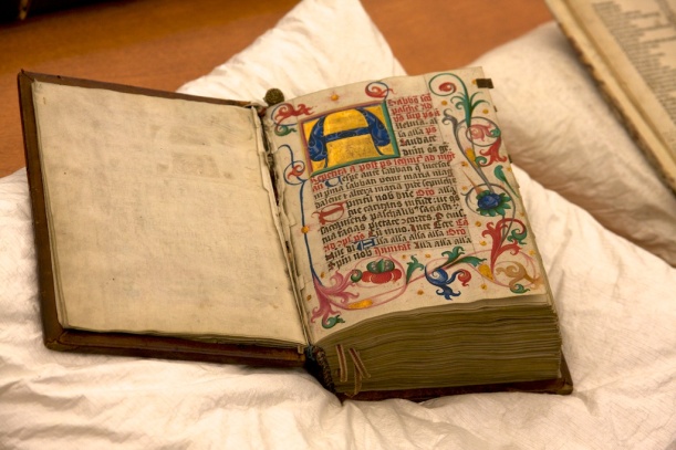
For my final posting, I wanted to share the photos I took on our class trip to the Vancouver Public Library’s Special Collections floor. We saw some amazing books.

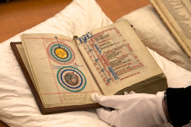
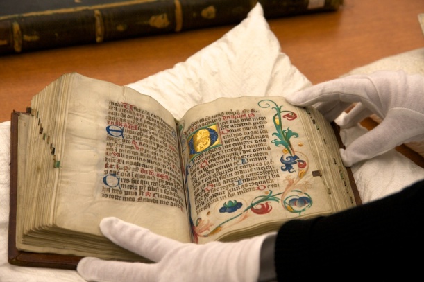
The first three photos are of an abbess’ Book of Days, an incunabula on vellum.

_MG_1067 _MG_1068 _MG_1071

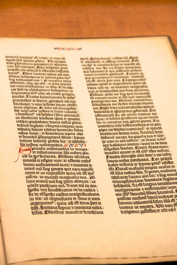
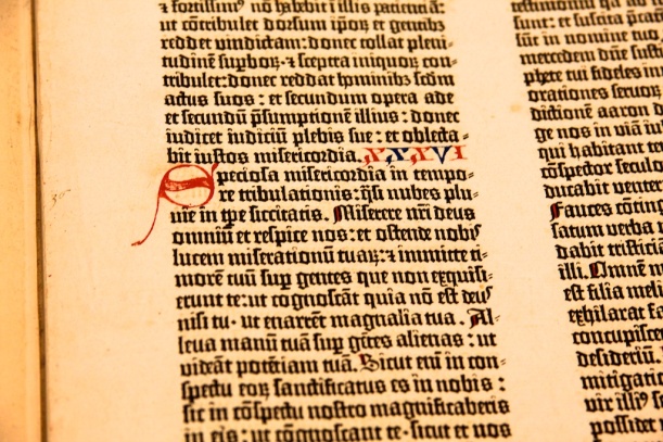
We then saw a leaf from the Gutenberg bible.

_MG_1074 _MG_1075

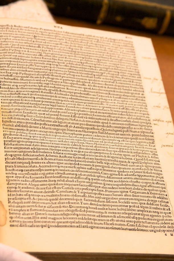
This was followed by an early book, printed in Venice. The page was densely covered in type.

_MG_1077 _MG_1078

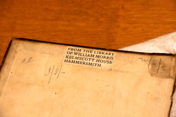
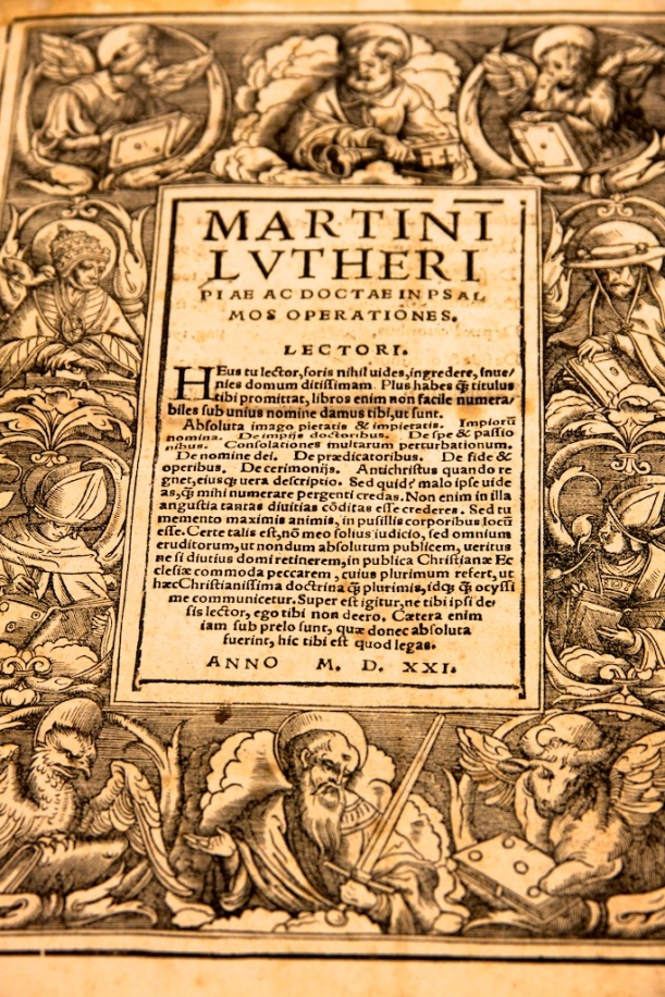
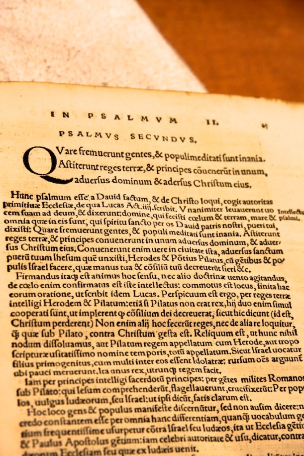
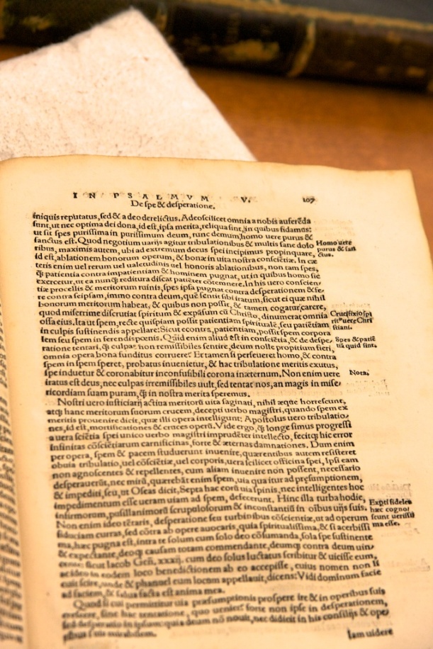
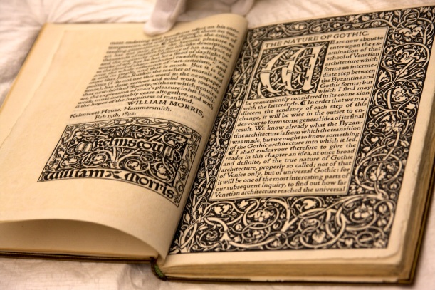
Of particular interest to me was a book fo Martin Luther’s works, in Latin, that had been owned by William Morris. One has to wonder how much influence the typesetting and type design had on Morris himself.

_MG_1079 _MG_1080 _MG_1081 _MG_1082

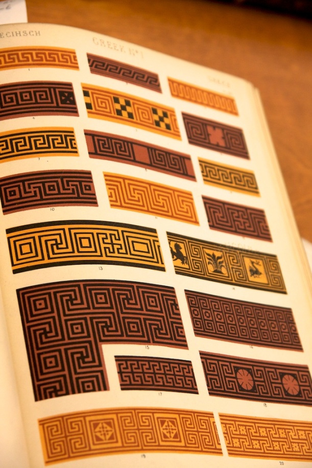
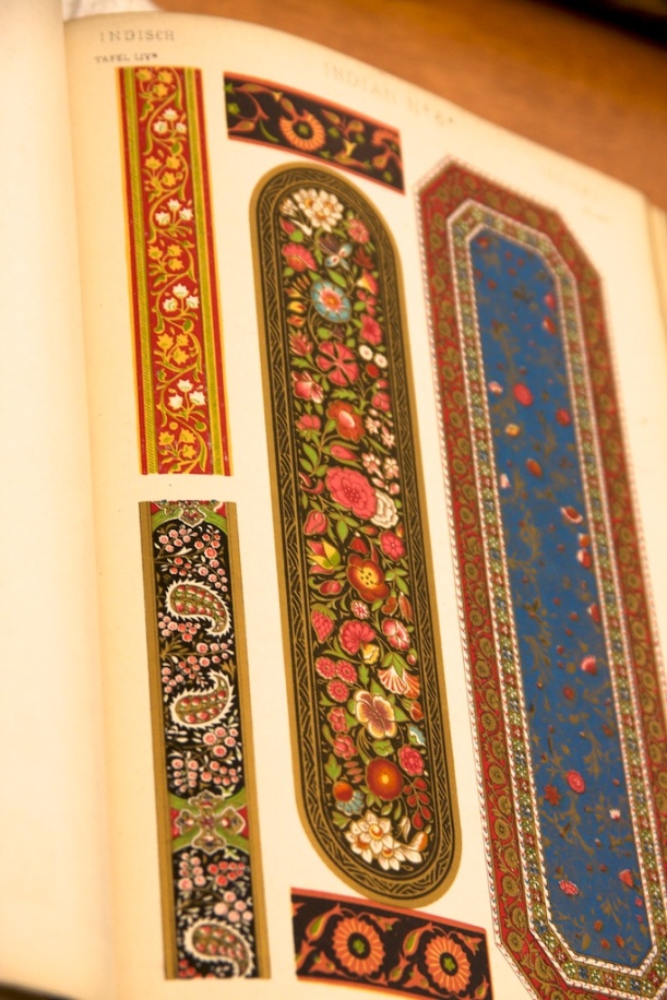
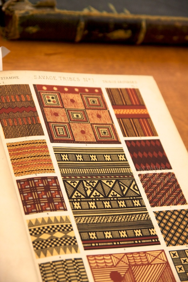
To contrast against Morris, we also looked at Owen Jones’ Grammar of Ornament.

_MG_1083 _MG_1084 _MG_1085

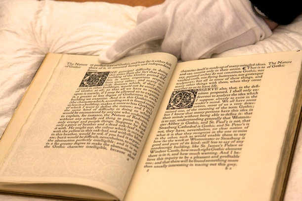
There was a classic example of Morris’ work available as well. True to form, the frontispiece was more elaborate than the inner pages.

_MG_1086 _MG_1088

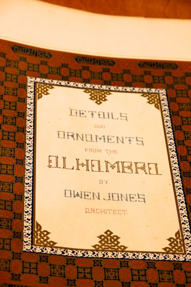
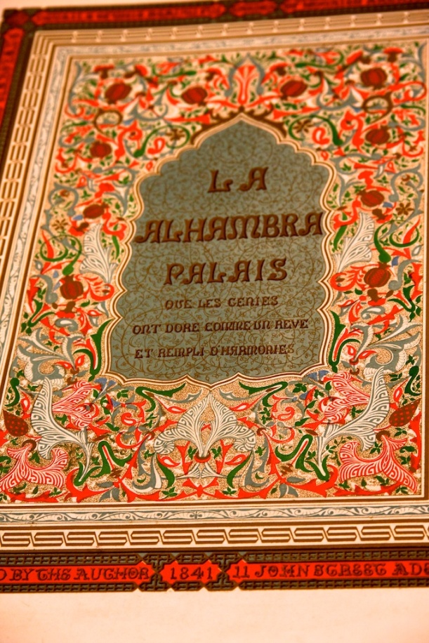
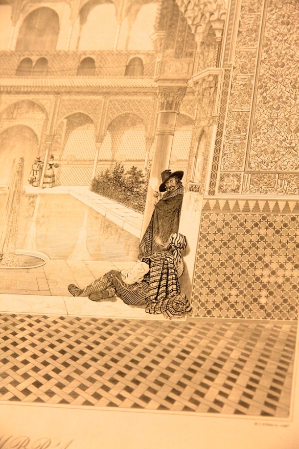
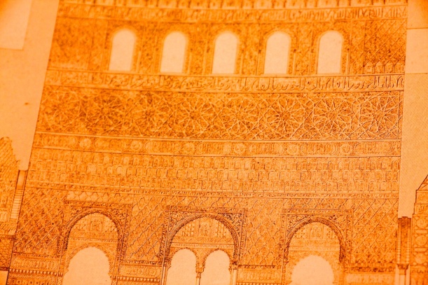
Finally, we looked at Owen Jones’ masterpiece, his two volume work on Alhambra. It was exquisite and reminded me of all the work I’d done on Islamic themes.

_MG_1089 _MG_1090 _MG_1091 _MG_1092 _MG_1093


Leave a comment

The King James Bible or Shakespeare

The last class reviewed the early history of the printed page, from the Roman-inspired incunabula through the advent of Gutenberg A comment made by the professor was how Gutenberg’s bible led to the standardization of modern German. And although there was no German state, there was certainly a German language. The Gutenberg bible, therefore, standardized orthography and word use.

I began to wonder, therefore, about modern English. I had read and long believed that Shakespeare, with his extremely broad and inventive vocabulary, and his active adoption of non-London dialects into his plays, had a profound impact on the standardization of modern English.

But when you consider that it was indeed the KJV of the bible that had a far greater scope of reach than Shakespeare (after all, most homes would have a bible, but not everyone would bother to buy plays), I began to realize that the KJV would have a much greater impact than Shakespeare.

Indeed, the King James bible added 257 idioms to English, more than any single source, including Shakespeare, including, according to Wikipedia, feet of clay and reap the whirlwind. Not to mention the standardized orthography.

I guess Shakespeare worship is best left to the English literature department. His plays are brilliant, but he didn’t have the overall effect on modern English at the level that the KJV did.


1 Comment

Vienna Secession Typeface Reborn in Psychedelia

We were reviewing the various movements that followed on after Art Nouveau (Jugendstil, the Glasgow School, and the Vienna Secession), and it was interesting to see how the typefaces of the Vienna Secession developed. At first they were similar in their clarity and elongated forms to those of the Glasgow School, but they soon developed more abstract, less legible, forms.

Of particular note was one by Alfred Roller, shown here in an example of a calendar page from Ver Sacrum.

Ver Sacrum August

Alfred Roller typeface in Ver Sacrum

When I saw this I immediately thought of the typeface used in late 1960s psychedelia posters, particularly those from San Francisco. I found two examples that used Roller’s typeface:

brignallimg2Jefferson Airplane at the Fillmore

I think it’s great that it might have taken nearly 70 years for the renaissance to occur, but that a perfect one did happen for Roller’s very unique typeface.


Leave a comment

Art Nouveau’s Birth in a Chair

Last week we were looking at artists from the Victorian age, and one in particular that struck my eye was Mackmurdo.

He produced a set of five chairs in 1882 that clearly predates that Art Nouveau movement by perhaps as much as 20 years, yet is clearly a precursor of Art Nouveau in its styling. To wit:

Mackmurdo Chair

The fluid lines suggestive of, yet not representational of, plant forms, are clearly the same as seen in Art Nouveau works.

For example, the design of the Paris metro stations by Guimard:

Guimard Metro Station

Guimard Metro Railing

Guimard designed these stations in 1900, just to give an indication as to how far after Mackmurdo his work came.


Leave a comment

Changing Book Design

One of the slides we had a brief look at in class was a classic example of Victorian book cover design, The Pencil of Nature.

The Penicl of Nature

This dates to 1844. What amazes me is the similarities and differences in what William Morris was doing nearly 50 years later in book design.

William Morris Book Design

We still have an ornate sense of decoration, albeit an organic one, but there has been a shift from blackletter typeface to a more humanist transitional typeface (designed by Morris). Morris also uses a a more traditional canon (dating back to Gutenberg) for the layout of the page, instead of centering it.


Leave a comment

Mighty Ships

In reviewing the lecture slide show from the class that I missed, the image that struck me the most was that of a WWII US Navy recruiting poster:

Image

It was clearly referential to the Art Deco masterpiece of Cassandre:

Image

I love how the Navy was referencing a work of romance and art to create something needed for recruitment. It takes the art of the Navy to a whole new level.


2 Comments

Bauhaus Thoughts

We reviewed the Bauhaus last week, moving, as we are, in reverse chronological order through the history of design schools.

Although it was not touched upon in class, it was clear how the Bauhaus was the genesis of the streamlined school of design that eventually led to product design such as Braun and Olivetti, and thenceforth to Apple, under the direction of Sir Jonathan Ive.

The other thing that struck me, as we reviewed Bauhaus architecture, was how there were echoes in the work of Frank Lloyd Wright, whose designs both preceded and followed the Bauhaus movement.

One particularly striking moment was when we looked at the work of the De Stijl architect, Rietveld.

The Rietveld Schroedhuis

For me this 1924 work very much prefigures Wright’s Fallingwater house, which was built much later in 1937.

Fallingwater

To compare apples to apples, we can look at what Wright did in 1923, the Imperial Hotel in Tokyo:

The Imperial Hotel

This is much more reminiscent of Rennie Mackintosh than Rietveld, so I think that the Bauhaus/De Stijl impact on Wright occurred only after Wright started developing his Mature Organic Style in the late 1920s and early 1930s.


Leave a comment

Swiss Modernism

There are only a few things I can immediately and personally relate to Swiss Modernism, although I know the impact of the movement is huge.

The first would have to be the design choices for the New York subway system which rely on the Helvetica typeface, the signature typeface of the Swiss Modernism movement. I specifically remember using the subway back in 1983 and 1984, during the last year of high school, on Saturday mornings, when I a few other classmates were taking advanced science classes at Columbia University. We would take the bus from Rockland County down to the Port Authority Terminal at 175th Street and then switch to the the subway, take the 1 to 116th Street. Sometimes, once class was done, we would ride the subway all the way down to Greenwich Village to go shopping on Broadway in Soho for cool accessories that were definitely not available in Rockland.

The other experience I have with Swiss Modernism is the museum literature I remember from my time in Japan. Since exhibit portfolios were always designed with in at least Japanese and English, if not more languages, the layout of the portfolios were always, unbeknownst to me at the time, set in the Swiss Modernist format, with multiple columns, based on grids, with photos of the exhibit pieces prominent.

I think I unwittingly copied that style, if perhaps only faintly, when I was laying out documents for my first design job in Japan. We needed to have Japanese on one page and English on the next, so we had tight columns of text to make it economical and legible. This was before I had any design training whatsoever, so I was simply imitating what I saw and liked.


Leave a comment

Post-modernism Fallout

Although I was never a student in any of the post-modern history classes, they were decidedly present in my late 1980s college. Gay history. Feminist history. Black history.

And as a gay man, I made an effort to read books that re-emphasized the role of gay men and women throughout history. Especially on our history. Books that dealt with Stonewall and the gay liberation movement.

But the overall result of this is a fractured history. People need to have a comprehensive view of history that encompasses all of the minority viewpoints. There should be no need for separate hyphenated histories. All of our histories should be told as one.

Yes, that would make textbooks and class content much denser, but it would also make them much richer, and would offer everyone the chance to see themselves reflected within history’s pages without the need to break apart into dedicated courses at the university level.

I know there is some effort to do this, but I also know it is met with resistance. It is hard to change the normative approach.